
Bros Don’t Cry Shirt
$19.99

Products are fulfilled and shipping from the
Oct 18
Oct 20 - Oct 21
Oct 21 - Oct 26
Bros Don’t Cry Shirt – Graphic Streetwear With a Playful Take on Masculinity
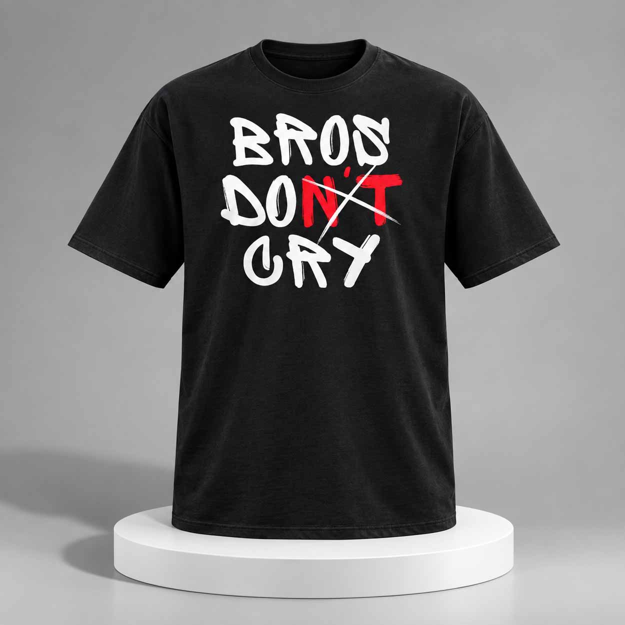
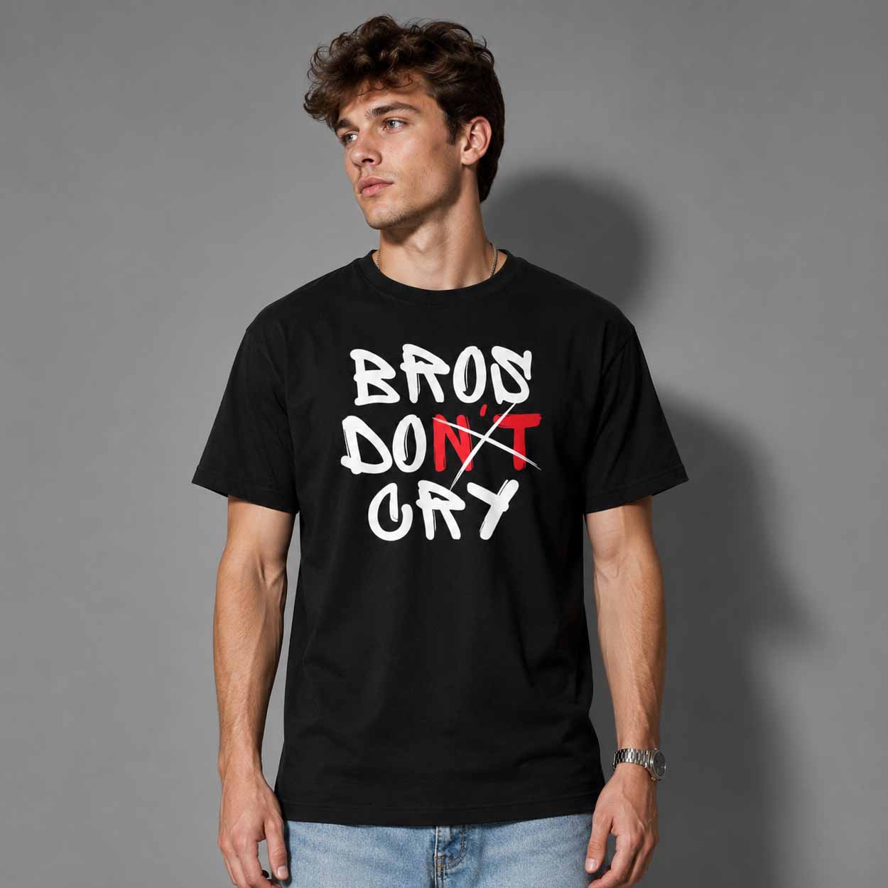
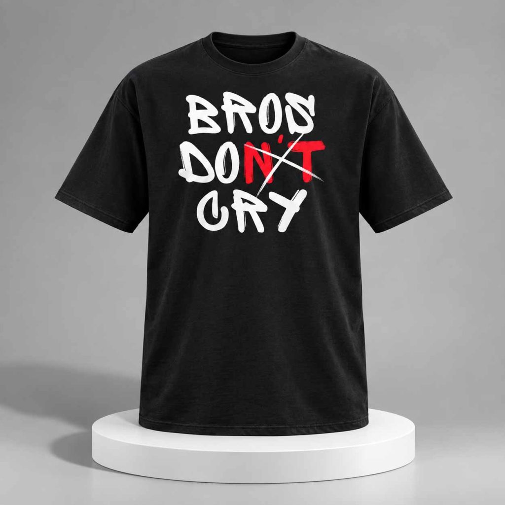
The Bros Don’t Cry Shirt makes its message impossible to miss. Set against a black T-shirt, oversized hand-drawn white lettering spells out “BROS DON’T CRY,” while the red “N’T” and sharp crossing strokes create a rebellious, graffiti-inspired focal point. The irregular typography gives the artwork the spontaneous feel of marker writing or street art rather than polished corporate graphics, making the shirt feel at home in contemporary casual and youth streetwear.
Bros Don’t Cry Shirt and the Streetwear Meaning Behind the Design:
- Visually, the contrast between black fabric, bright white lettering, and the flash of red gives the design an intentionally raw character. The crossed treatment around “DON’T” adds another layer of ambiguity: the phrase can be worn straightforwardly, humorously, or even as a tongue-in-cheek challenge to the old expectation that men should hide emotion.
- That flexibility is what makes the Bros Don’t Cry Shirt particularly suited to modern graphic-shirt culture. Instead of depending on a specific celebrity or entertainment franchise, the artwork works as a conversation piece built around friendship, masculinity, humor, and recognizable internet-era language.
Ultimately, the Bros Don’t Cry Shirt stands out without needing an invented celebrity connection. Its graffiti lettering, striking red accent, and familiar phrase turn an old piece of “bro code” language into a bold modern graphic that can be interpreted with humor, irony, or a little social commentary.
Shipping Policy & Manufacturing Info
Our shirts are made when ordered. Due to the time variability of on-demand manufacturing, we offer 2 options for how quickly you want to receive your order. You can select from the following choices in checkout.Standard Shipping ($4.99+)
- Orders using this option generally arrive 5-10 days (U.S. orders) and it takes 2 weeks for International orders after being manufactured and shipped. (See notes below)
- Manufacturing times for this option vary more around busier times of the year or during extreme circumstances such as covid-19 shutdowns.
Shipping and expedited manufacturing ($19.99+) (U.S. Only)
- Orders using this option jump to the front of the manufacturing queue which can generally save a couple days (or more during busier times of the year).
- It's highly recommended to use this option if you are ordering for a specific event or holiday.
- Orders using this option generally arrive 2-3 days after being manufactured and shipped. (U.S. only)
- Orders using expedited manufacturing will be printed when the next batch of orders are processed which can vary depending on seasonality and other factors.
Please Note:
- We do not guarantee shipping or arrival dates.
- Manufacturing during the majority of the year takes between 1-5 business days (Mon-Fri) however can take more than a week during the heaviest shopping times of the year. Extreme circumstances such as covid-19 may delay order manufacturing and/or shipping by an additional week or more.
- All manufacturing and shipping times mentioned are just estimates and will vary.
- Some of our popular designs may be pre-printed and may ship out faster than less commonly ordered designs/style/color combinations.
 Bros Don't Cry Shirt
| 5 star | 0% | |
| 4 star | 0% | |
| 3 star | 0% | |
| 2 star | 0% | |
| 1 star | 0% |
Sorry, no reviews match your current selections